


Search “real estate website design” and you'll get galleries of handsome heroes with palm trees. They're nice to look at and useless to learn from, because a screenshot can't show you whether the design ever produced a buyer. So this is a different kind of design article: a walkthrough of Domlivo, the property platform we built and run ourselves — ~5,900 unique visitors a month, all of it organic (search, AI assistants and direct — the site has never run an ad). Every principle below is illustrated by the live site and backed by its numbers.
1. The first screen sells inventory, not the agency
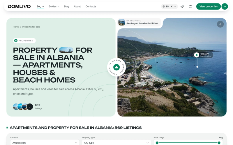
Buyers don't arrive wondering who you are; they arrive wondering what you have. The first screen answers with facts: a live count of listings (869 at this screenshot), the real lowest price pinned to a real photograph of the place, and a single obvious next action. The agency's story can wait for the about page — the inventory is the hero. This is the single most common inversion we see on agency sites: the design celebrates the brand and hides the stock behind three clicks.
2. The catalogue is a split view — and honesty is a design element
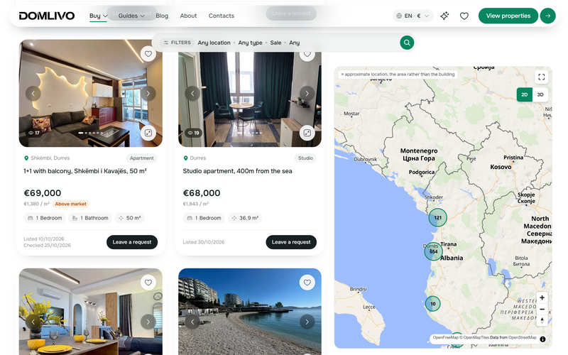
The pattern buyers already know from the big portals — cards on the left, map on the right — is the pattern to give them. But look closer at the cards, because that's where trust is designed in: price per square metre next to the asking price, an “Above market” badge computed against our own price index, a “Listed / Checked” date pair that tells the buyer the stock is alive, and view counters. Even the map is honest — the note says locations are approximate, the area rather than the building. Every one of those microcopy decisions costs a conversation with a seller and earns a buyer's trust. None of them requires a designer's taste; they require the courage to show data.
3. The listing page answers before it asks
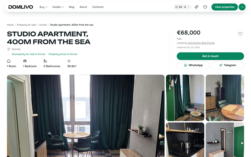
A buyer who has to message you to learn the floor area will message a competitor who published it. The listing page carries the gallery, the price with its per-m² context, the key facts and the costs around the purchase — and only then the enquiry form. Counterintuitive but true in our funnel: the more a page answers, the more enquiries it produces, because the enquiries that arrive are from buyers who already qualified themselves.
4. Tools are design: give buyers something to do
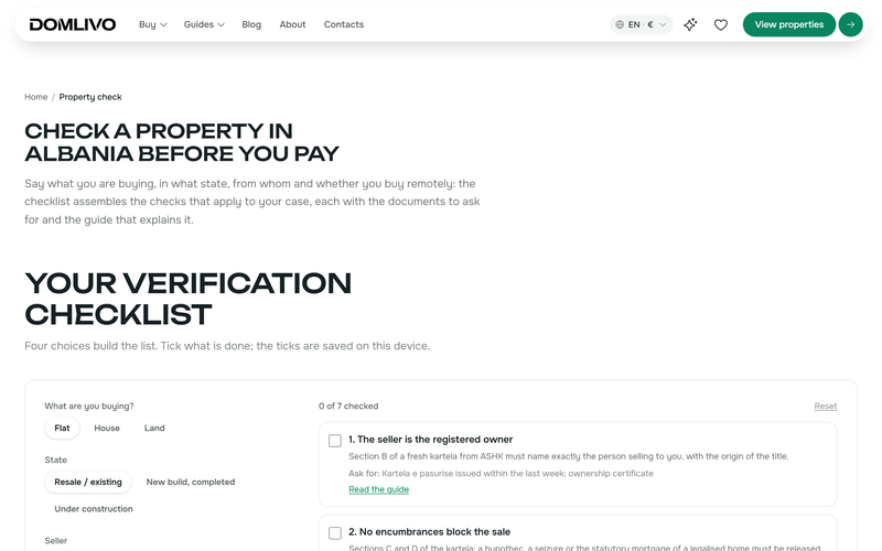
Between “started dreaming” and “ready to enquire” there are weeks of research, and most agency sites offer nothing to do during them. We designed tools for that interval: purchase-cost and running-cost calculators, a rental-yield calculator, an interactive legal-check checklist, a residency-route checker. They keep returning visitors returning — and they're precisely the pages AI assistants cite, because their outputs are concrete. Tools are not a gimmick bolted onto design; on a property site they ARE the design of the research phase.
5. The design Google sees: pages, speed, languages
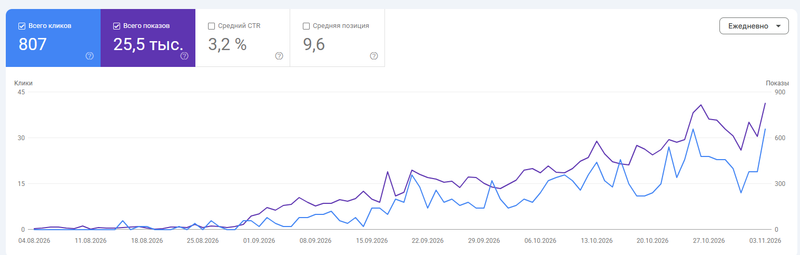
Most of “design for search” is architecture a visitor never consciously sees: every listing is its own server-rendered page with schema markup; every city-and-type combination is an indexable catalogue page; photos go through an image pipeline so the pages stay fast; and the whole site exists in 8 languages with hand-written translations and per-language URLs — a German buyer lands on a German page, not on a translate widget. The graph above is what that architecture did in its first three months, from a standing start, with zero advertising.
6. The third audience: design for AI assistants
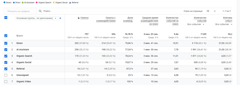
Buyers increasingly research through ChatGPT before they ever type into Google — and an assistant can't be charmed by a hero image. It cites sites whose facts are checkable: our knowledge base attributes every number to a quoted primary source, our price index publishes open data, and AI crawlers are explicitly allowed. The result is measurable: AI assistants are the site's #2 traffic channel and its best-converting one, and 28% of CRM leads arrive with chatgpt.com as the referrer. The full method is in our ChatGPT-leads playbook.
The checklist for your own site
- First screen: live inventory numbers, a real photo of your market, one search action. Brand story one click away, not zero.
- Catalogue: split view with a map; cards carrying price/m², dates and honest badges.
- Listing pages that answer everything an agent would be asked — before the form.
- At least one tool for the research phase: a cost calculator beats a brochure page.
- Architecture: a page per listing, a page per city×type, real multilingual URLs, photos through a pipeline.
- Facts with sources on the content side — buyers trust it and AI assistants cite it.
If you'd rather start from a platform where all of this is already built: the design above isn't a concept, it's a website for real estate agents you can launch under your own brand in a week — one-off from €3,900, extended build from €6,900, full source ownership from €19,000. And if you're still weighing a theme against a build, read templates vs custom, honestly compared first.
FAQ
Want these principles applied to your own agency site? That's our estate agent website design service — template on our engine from €1,500, custom from €2,500, the full Domlivo level from €3,900, all one-off.
One design question we get weekly from international agents: do you need an IDX website? (Outside the US — no, and here’s why).