

Clients often ask me to "make it beautiful". But beautiful is a side effect. The real job of commercial design is to walk a person to an action: an enquiry, a booking, a purchase. Here are nine moves we apply on every project — and the numbers they produced for real clients.
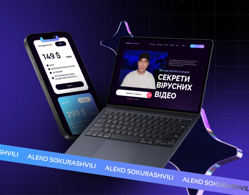
- One action per screen. Every screen answers one question and leads to one button. On the Aleko course landing page we cut everything that didn't lead to picking a tier — checkout clicks grew 2.4×.
- The button where the user is ready. Not just the header: after the benefits, after the prices, after the reviews. Nobody should scroll back to say "yes".
- Real photos instead of stock. Efedra: practitioner and room photos instead of stock smiles — part of the redesign that delivered 3.2× enquiries. Stock saves a day at the start and costs enquiries for years.
- Numbers instead of adjectives. "Fast service" is noise. "We reply within 4 hours" is a fact. Numbers read faster and stick longer.
- Prices in plain sight. Prices filter out mismatched clients and build trust with the right ones. Hiding the price list means paying a manager to talk to people who can't afford you.
- Social proof next to the action. A review or a number right beside the button — not on a separate page. The Tatarka franchise landing spoke investor: unit-economics numbers next to the form — over $250,000 raised.
- A 2–3 field form. Every extra field costs you a share of enquiries. Name and contact; sort the rest out in the conversation.
- Speed is design too. The best layout doesn't work at second five of loading. Animations that don't lag, mobile-optimised images, Lighthouse 90+.
- One accent colour. When everything is bright, nothing stands out. One colour for actions, the rest is background. The eye finds the button on its own.
How to apply this to your site
Open your site and walk the list: where's the action on each screen? Where are the numbers? Where are the prices? We packed these moves into a 10-question checklist in our medical website design teardown — it works for any niche.